


Brand Guidelines
This guide defines the visual language, design style, and principles that shape a clear and consistent brand experience, no matter the team or area of expertise.
At its core, Utter is driven by a commitment to clarity and care—mirroring our mission to deliver breakthrough therapies for people living with immune-mediated diseases. These guidelines outline the key visual and communication standards that express our brand’s values: integrity, excellence, and innovation.
Whether you’re crafting a digital experience or printed collateral, this guide ensures every touchpoint aligns with Utter’s purpose.
01
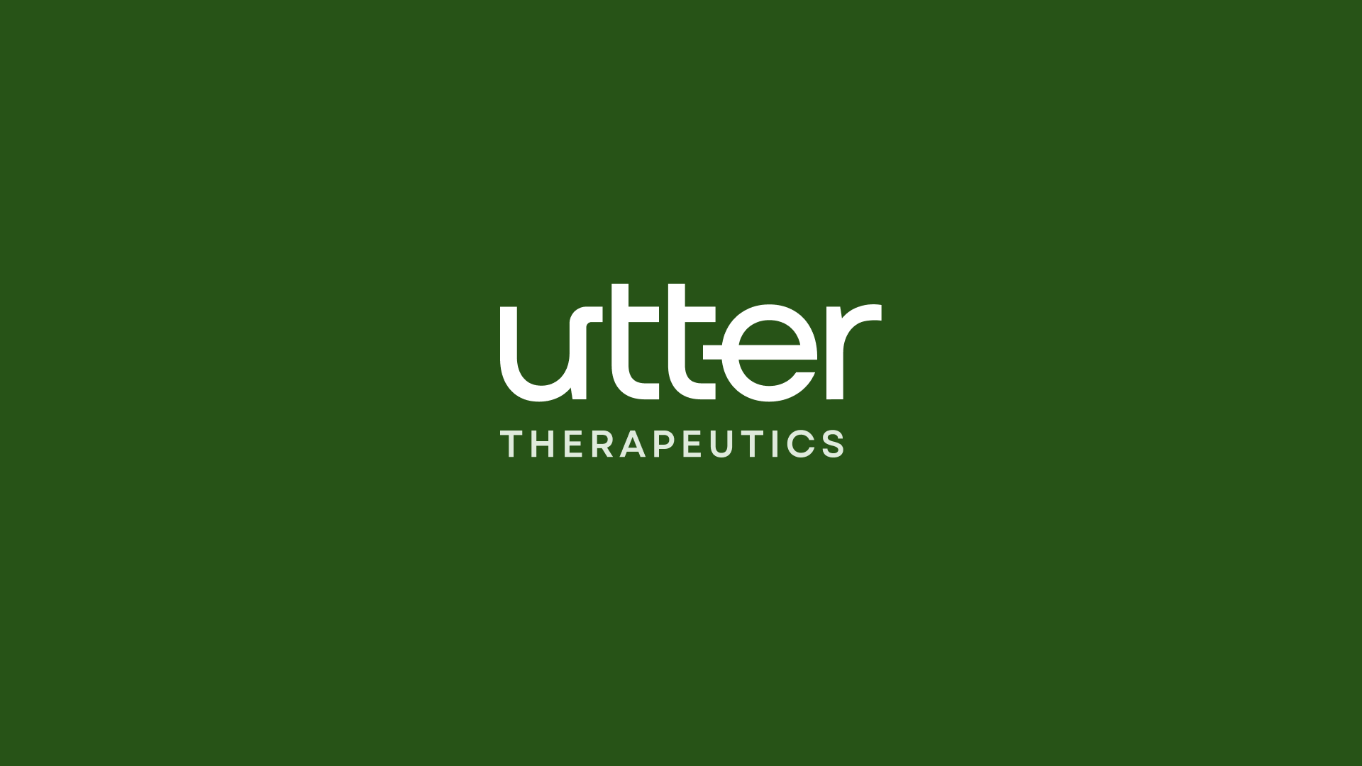
Logo
The Utter Therapeutics logo is a modern, clean wordmark that emphasizes clarity and approachability. The use of lowercase letterforms and a bold typeface reflects both innovation and trust. The clear space ensures legibility and consistency across applications.
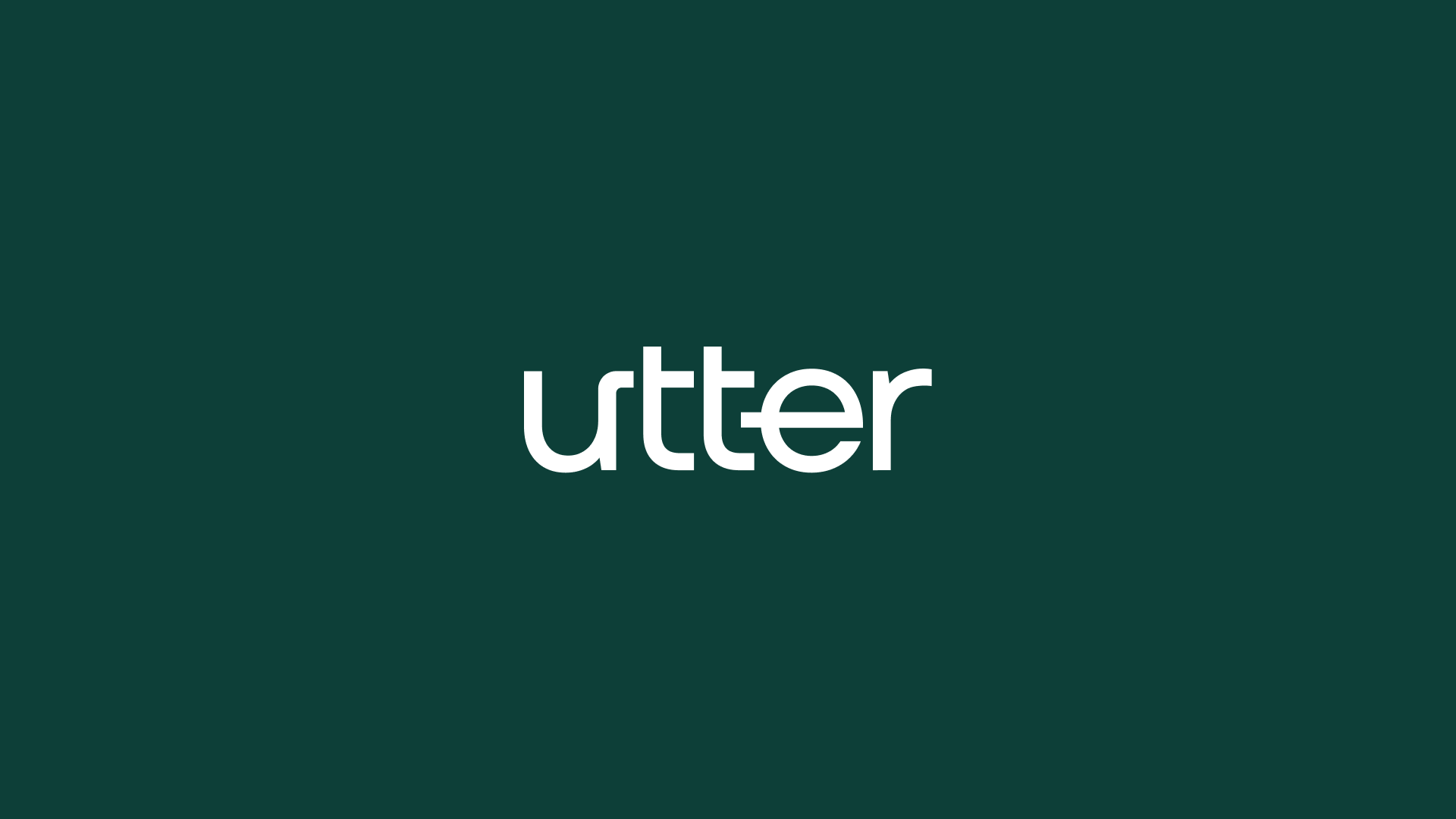
1a
Primary Lockup
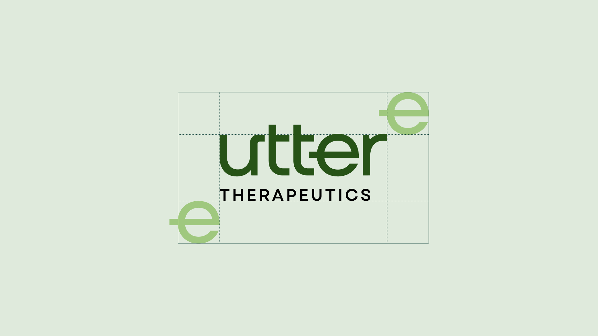
1b
Clearspace
1c
Secondary Lockups
1d
Incorrect Usage
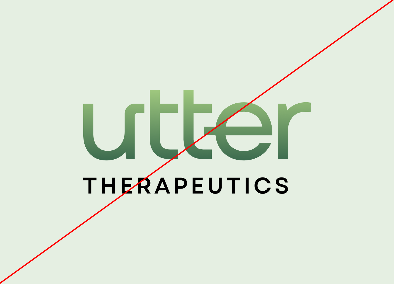

Do not use gradients in the logo
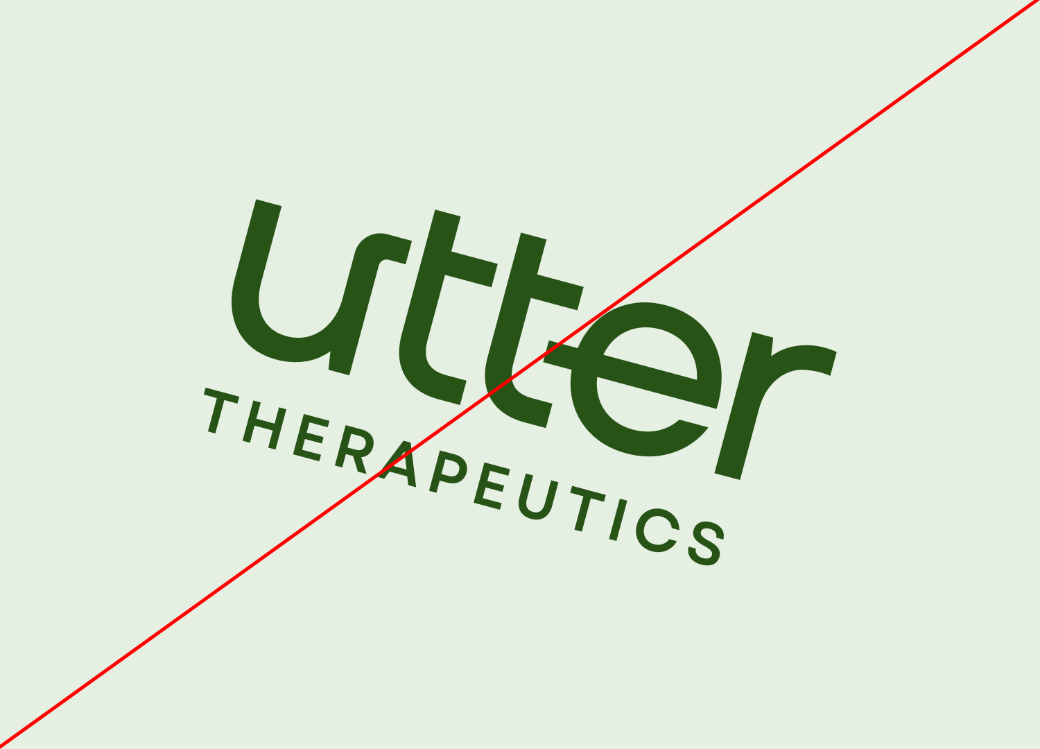
Do not rotate the logo
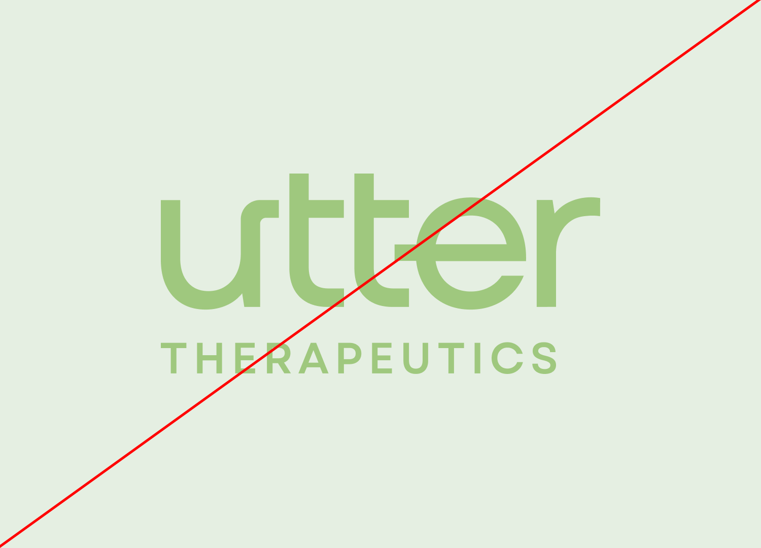
Avoid low contrast combinations
1e
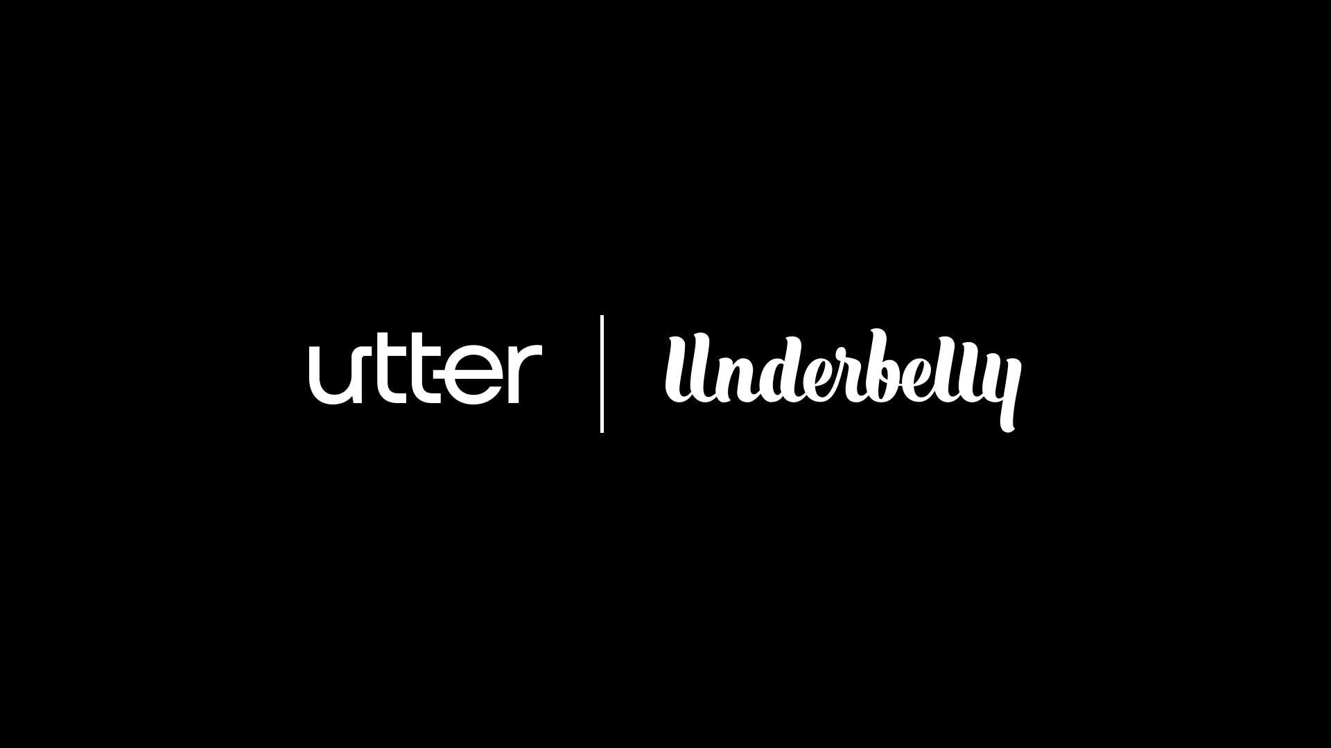
Partnerships
02
Color
Our color palette uses rich, earthy greens paired with calming neutrals to communicate wellness, balance, and scientific precision. These hues work together to create a cohesive and flexible system for both digital and print use.
2a
Primary Palette
Orange
Hex: #275317
Evergreen
Hex: #0D3F38
Mist Green
Hex: #C6EBF7
2b
Secondary Palette
Graphite Black
Hex: #232323
Pure White
Hex: #FFFFFF
03
Typography
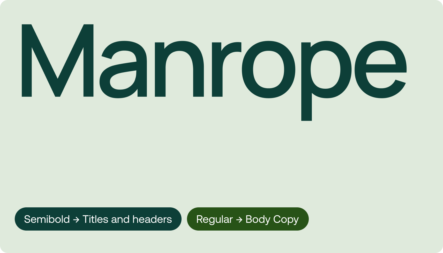
We use the Manrope typeface to reinforce a contemporary and accessible voice. Semibold is reserved for headlines and titles, while Regular is used for body text to ensure clear and comfortable readability across all formats.
Download Manrope from Google Fonts
04
Putting it all together
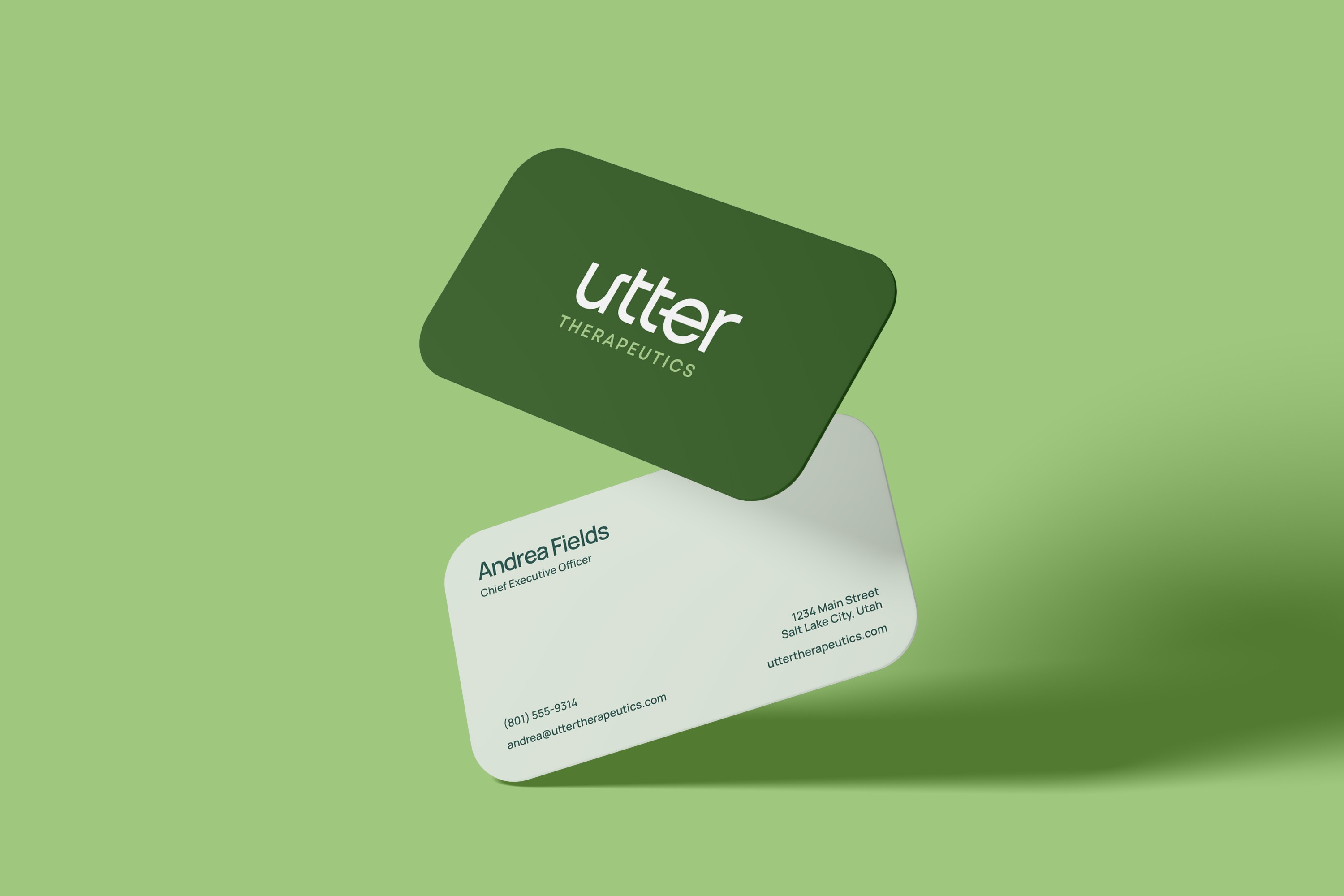
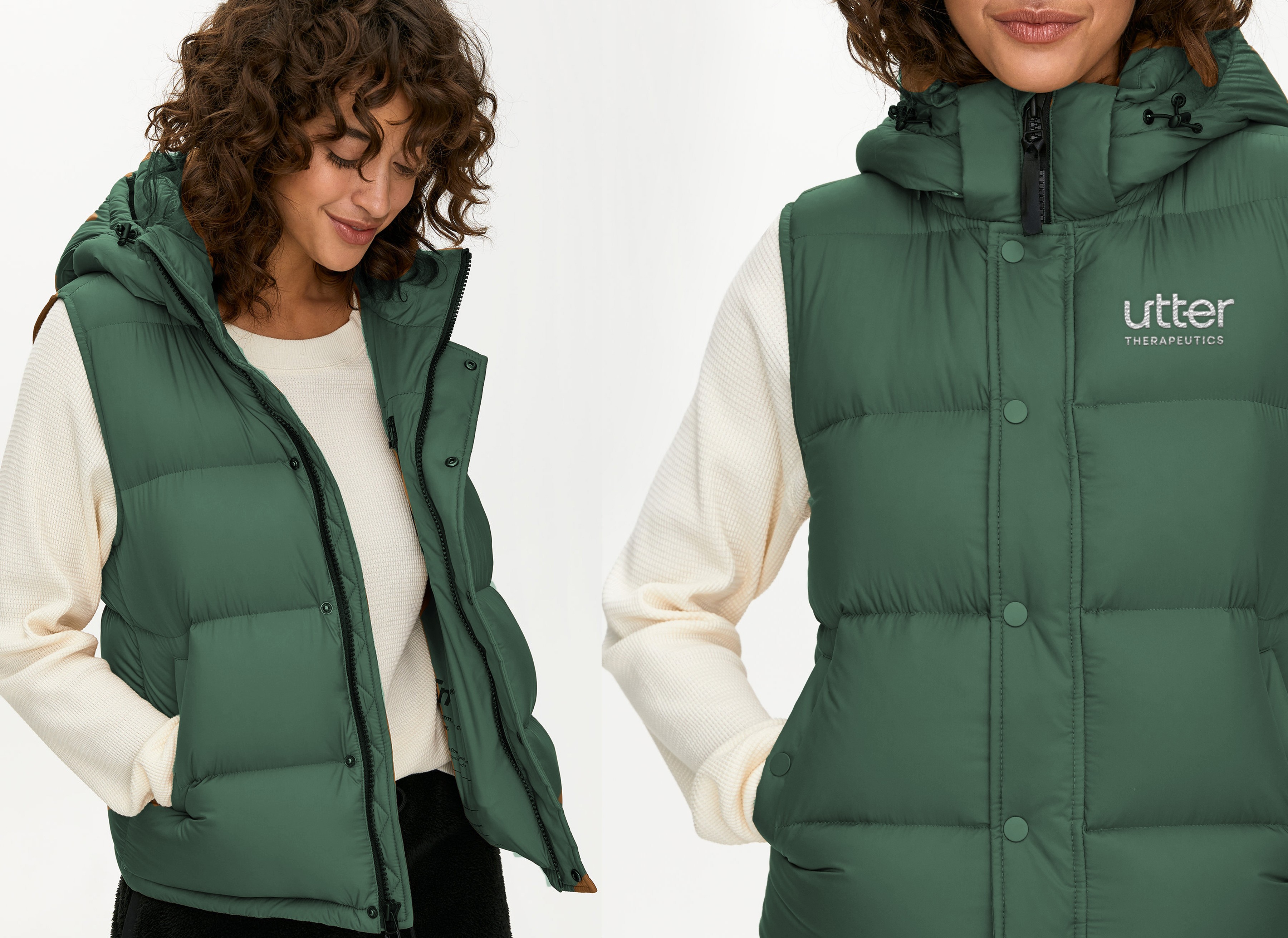
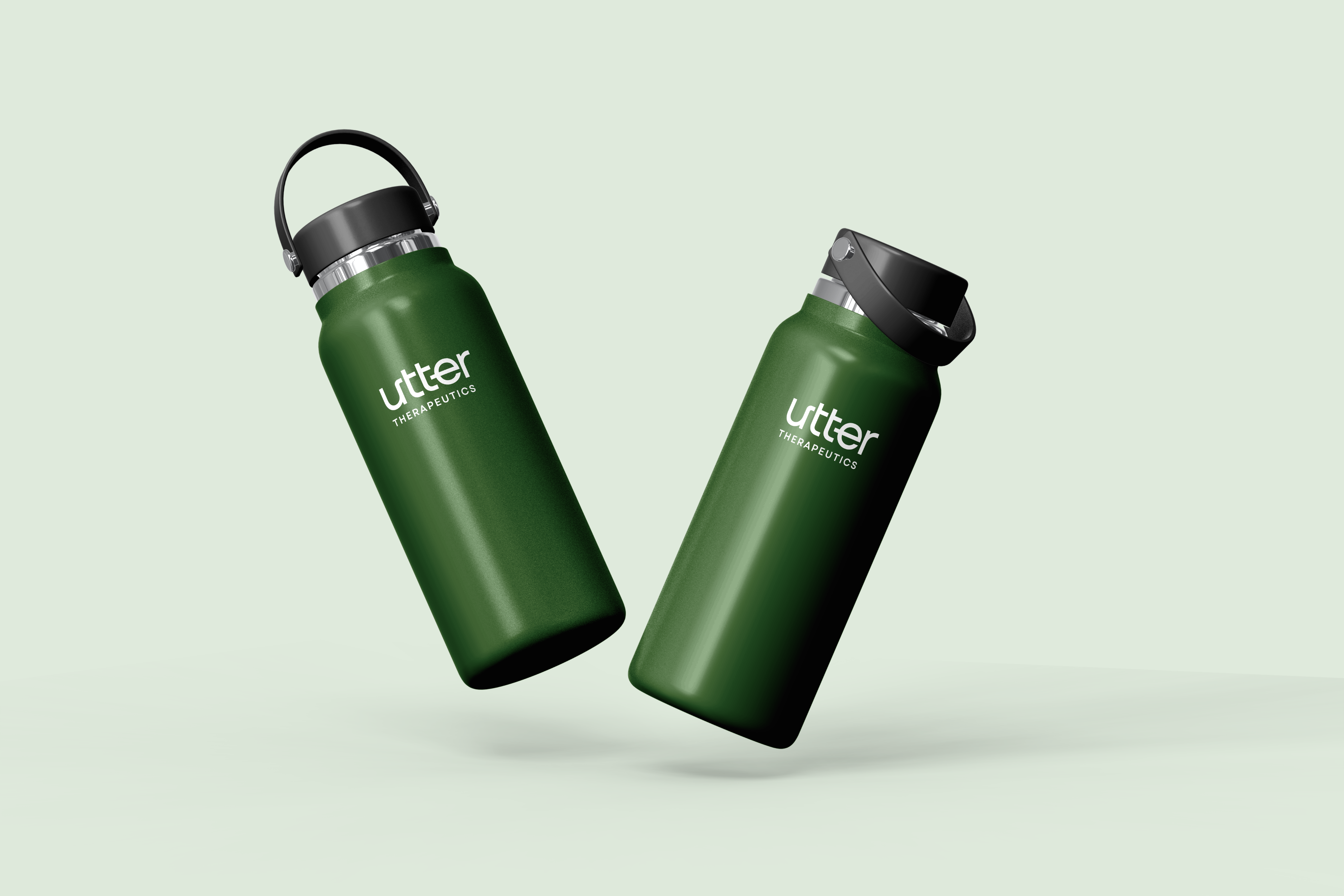
When applied cohesively, the brand elements create a unified and compelling visual identity. Photography, layout, color, and typography combine to tell the story of Utter Therapeutics—revolutionizing care through thoughtful, human-centered design.

About Us

Our Values
Revolutionizing
cancer treatment by rethinking drug delivery


Submit a Creative Request
Back to the top
↑
Made with 💙 in Salt Lake City by Underbelly Creative.

Brand Guidelines
This guide defines the visual language, design style, and principles that shape a clear and consistent brand experience, no matter the team or area of expertise.
At its core, Utter is driven by a commitment to clarity and care—mirroring our mission to deliver breakthrough therapies for people living with immune-mediated diseases. These guidelines outline the key visual and communication standards that express our brand’s values: integrity, excellence, and innovation.
Whether you’re crafting a digital experience or printed collateral, this guide ensures every touchpoint aligns with Utter’s purpose.
01
Logo
The Utter Therapeutics logo is a modern, clean wordmark that emphasizes clarity and approachability. The use of lowercase letterforms and a bold typeface reflects both innovation and trust. The clear space ensures legibility and consistency across applications.
1a
Primary Lockup
1b
Clearspace
1c
Secondary Lockups
1d
Incorrect Usage
Do not use gradients in the logo
Do not rotate the logo
Avoid low contrast combinations
1e
Partnerships
02
Color
Our color palette uses rich, earthy greens paired with calming neutrals to communicate wellness, balance, and scientific precision. These hues work together to create a cohesive and flexible system for both digital and print use.
2a
Primary Palette
Orange
Hex: #275317
Evergreen
Hex: #0D3F38
Mist Green
Hex: #C6EBF7
2b
Secondary Palette
Graphite Black
Hex: #232323
Pure White
Hex: #FFFFFF
03
Typography
We use the Manrope typeface to reinforce a contemporary and accessible voice. Semibold is reserved for headlines and titles, while Regular is used for body text to ensure clear and comfortable readability across all formats.
Download Manrope from Google Fonts
04
Putting it all together
When applied cohesively, the brand elements create a unified and compelling visual identity. Photography, layout, color, and typography combine to tell the story of Utter Therapeutics—revolutionizing care through thoughtful, human-centered design.

About Us
Our Values
Revolutionizing
cancer treatment by rethinking drug delivery

Submit a Creative Request
Made with 💙 in Salt Lake City by Underbelly Creative.
Back to the top
↑

Brand Guidelines
This guide defines the visual language, design style, and principles that shape a clear and consistent brand experience, no matter the team or area of expertise.
At its core, Utter is driven by a commitment to clarity and care—mirroring our mission to deliver breakthrough therapies for people living with immune-mediated diseases. These guidelines outline the key visual and communication standards that express our brand’s values: integrity, excellence, and innovation.
Whether you’re crafting a digital experience or printed collateral, this guide ensures every touchpoint aligns with Utter’s purpose.
01
Logo
The Utter Therapeutics logo is a modern, clean wordmark that emphasizes clarity and approachability. The use of lowercase letterforms and a bold typeface reflects both innovation and trust. The clear space ensures legibility and consistency across applications.
1a
Primary Lockup
1b
Clearspace
1c
Secondary Lockups
1d
Incorrect Usage
Do not use gradients in the logo
Do not rotate the logo
Avoid low contrast combinations
1e
Partnerships
02
Color
Our color palette uses rich, earthy greens paired with calming neutrals to communicate wellness, balance, and scientific precision. These hues work together to create a cohesive and flexible system for both digital and print use.
2a
Primary Palette
Range Green
Hex: #275317
Evergreen
Hex: #0D3F38
Mist Green
#DFEADC
2b
Secondary Palette
Graphite Black
Hex: #232323
Pure White
Hex: #FFFFFF
03
Typography
We use the Manrope typeface to reinforce a contemporary and accessible voice. Semibold is reserved for headlines and titles, while Regular is used for body text to ensure clear and comfortable readability across all formats.
Download Manrope from Google Fonts
04
Putting it all together
When applied cohesively, the brand elements create a unified and compelling visual identity. Photography, layout, color, and typography combine to tell the story of Utter Therapeutics—revolutionizing care through thoughtful, human-centered design.
About Us
Our Values
Revolutionizing
cancer treatment by rethinking drug delivery
Submit a Creative Request
Made with 💙 in Salt Lake City by Underbelly Creative.
Back to the top
↑